Why Typography Matters for Bilingual Families, Italian Travel Blogs, and Lifestyle Brands
/Bilingual family content has a special kind of trust built into it. A reader may arrive looking for advice on raising children with two languages, planning a trip to Italy, understanding cultural traditions, finding family recipes, or choosing resources that make language learning feel less overwhelming. Before they read every detail, the page has already made a visual impression.
Typography is part of that impression. A warm, readable type system can make a family blog feel personal, useful, and credible. A cluttered or difficult font choice can make even thoughtful advice harder to follow.
This is why typography is becoming more important for bilingual parenting blogs, family travel creators, lifestyle publishers, online educators, and small brands. Fonts are no longer only a design preference. They shape how readers scan, trust, save, and return to information.

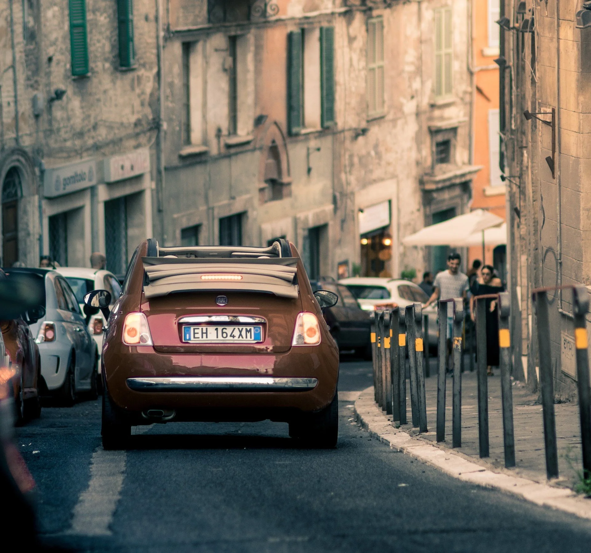
credit: unsplash.
Why bilingual and family content needs readable design
Parents and travelers rarely read in perfect conditions. Someone may be checking a language-learning tip during a school run, reading an Italian guide on a phone, saving a recipe while cooking, or comparing family travel advice late at night. Typography should reduce the effort required to understand the content.
· make bilingual resources easier to scan;
· keep travel details, names, dates, and places visible;
· support readers who may move between English, Italian, and other languages;
· make recipes, printables, guides, and product recommendations clearer;
· help newsletters, social posts, and blog pages feel connected.
From personal blog to multilingual brand system
Many parenting and travel blogs begin as personal spaces. Over time, they can become media platforms, newsletter businesses, affiliate hubs, family travel guides, bilingual resource shops, courses, books, or consulting offers. Typography needs to grow with that journey.
The goal is not to make a warm family blog feel corporate. The goal is to keep personality while adding clarity. Readers should feel the voice of the author, but they should not have to struggle through the design to find practical information.
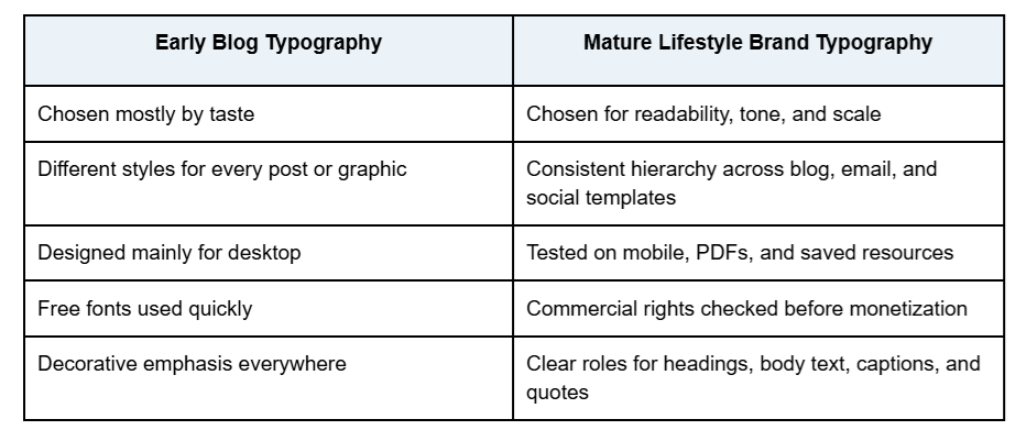
Commercial and custom fonts both have a role
Not every family creator, travel blogger, or bilingual educator needs a custom font. Many can build a strong identity with a professional commercial font family. Custom typography becomes more useful when a brand grows across many touchpoints or needs a more distinctive voice.
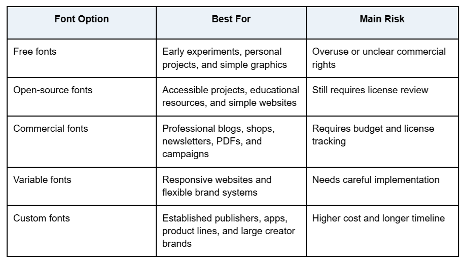
Creators comparing professional font families, variable fonts, or custom typography options can review foundries such as typetype.org when they need type systems that can be tested across websites, newsletters, brand materials, digital products, and campaigns.
Real custom font cases with lessons for lifestyle creators
Custom font projects may seem far from bilingual parenting or travel content, but they offer useful lessons. Large brands invest in typography because consistency, recognition, and usability matter when audiences meet the same brand in many places.
Telefónica Sans for Telefónica
Telefónica Sans, based on TT Hoves, shows how an existing typeface can be adapted to suit a large communication system. For multilingual creators and educators, this is a practical reminder that typography can evolve. A strong foundation can be refined as the brand matures rather than replaced completely.
TT Trailers for PetChoy
PetChoy used a customized TT Trailers in its rebranding. This case shows how expressive typography can add warmth and personality. Pet, food, children’s, craft, and family lifestyle brands often need to feel friendly and memorable while keeping essential information readable.
Font licensing should be part of the business plan
Font licensing is easy to ignore when a blog is small. But a font is software, and its license defines where and how it can be used. A typeface that is fine for a personal graphic may not be approved for a monetized website, ebook, logo, template, course, paid newsletter, or sponsored campaign.
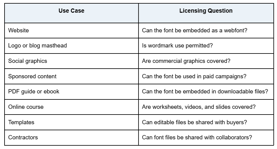
Common licensing mistakes
· using a personal-use font on a monetized blog;
· assuming every free font is free for commercial work;
· using a desktop license as if it were a webfont license;
· embedding a font in a PDF, course, or template without checking rights;
· sending font files to freelancers without permission;
· modifying letters without checking the EULA;
· losing license receipts before a redesign or brand partnership.
Typography mistakes that weaken reader trust
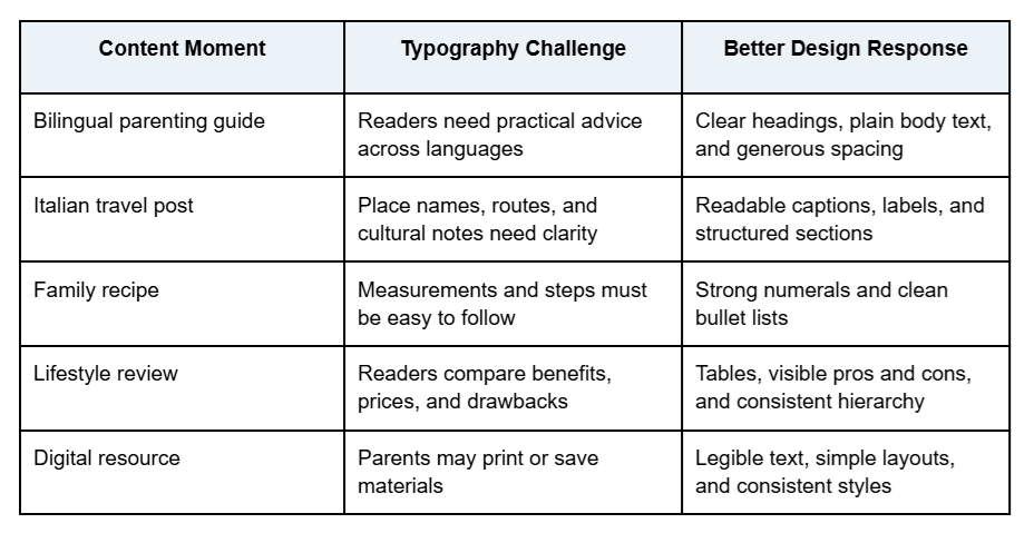
Most typography problems happen when creators design one asset at a time instead of building a simple system. A pretty font in a quote graphic may not work in a bilingual worksheet, recipe card, Italy travel guide, or long family essay.
· using too many decorative fonts on one page;
· choosing a stylish font that is hard to read on mobile;
· making captions, disclosures, or sponsored notes too small;
· using weak numerals for ages, prices, dates, or measurements;
· placing low-contrast text over travel or lifestyle photography;
· changing fonts between the blog, newsletter, and social templates;
· forgetting accented characters for Italian and other languages;
· ignoring line spacing in long posts.
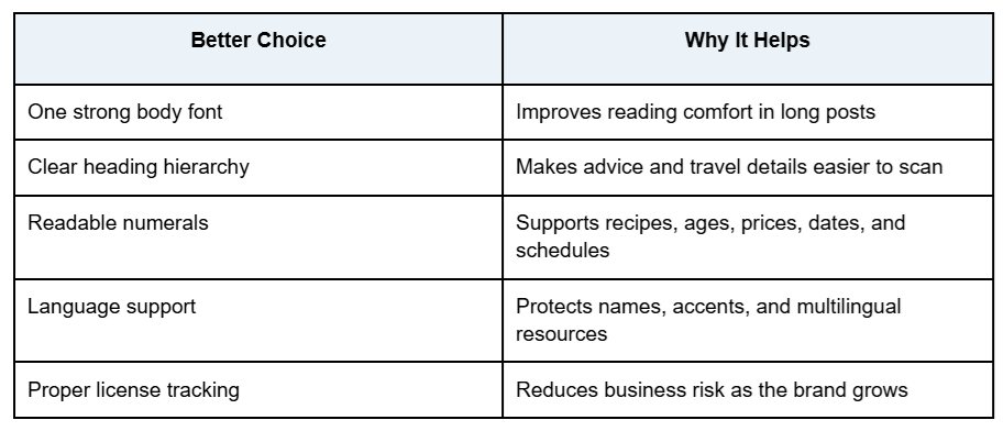
What this means for bilingual creators and family businesses
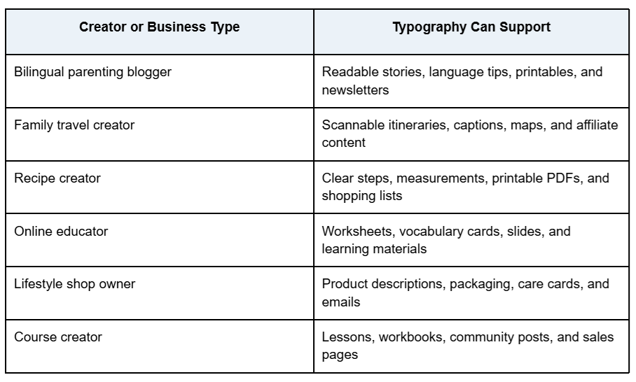
The encouraging part is that typography does not need to become complicated. A simple system with one readable body font, one clear heading style, consistent captions, language support, and documented licenses can already make a bilingual lifestyle platform feel more trustworthy.
Disclosure: This is a collaborative post.